vHelp.
A task management system for care providers and volunteer organisations
Overview
As the Covid pandemic progressed and lockdowns started to ease in the UK, an existing problem around supporting caregiving organisations and their volunteers was taken to a new level.
As a new startup, vHelp offers an innovative solution, supporting organisations in the organisation of tasks and expense management in a complex financial industry. I led the UX Design at the point of creating an initial MVP and have continued working closely with the team through their initial growth.
Role
Product (UX) Designer
Highlights
Led UX design from MVP through continued growth
Problem
Volunteers provide a vital part of UK community life with volunteer organisations providing services such as shopping and prescription collection for those who can't manage it themselves. The Covid pandemic stretched these organisations to the limit particularly in the areas of administration.
The aim of vHelp was to ease the burden in terms of administration by solving key pain-points such as the organisation and assignment of volunteers to "clients" and an approval flow for the payment of expenses these volunteers incurred.
Strategy
Key to the success of the project was understanding fully the existing pain-points for care giving organisation, volunteers and the end care receivers themselves. I worked closely with the founders running stakeholder sessions and managing customer journey mapping for multiple stakeholder levels to understand what was required at MVP level. I moved this vision forward into a UX design through rapid prototyping with initial user testing, as we pushed an MVP live with the view to quickly release improvements as new requirements were discovered.
User Journey Design
The application needed to cater to stakeholders from Director level within the organisation, down to the ultimate end user, the volunteer. To tackle this during discovery research I mapped the existing customer journeys for stakeholders, highlighting key pain-points. As a team we worked to eradicate these, formulating a happy path for each stakeholder which was tested and iterated through additional research before any interface work was carried out.
This initial work was shared amongst the design and development teams to ensure any potential barriers were considered early, saving time in failed experimentation later.
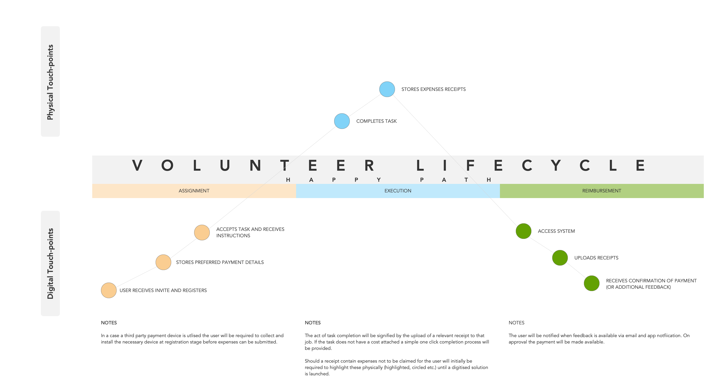
Customer journeys were mapped for each stakeholder to consider the present and proposed customer journeys
Wireframes
As always wireframes started extremely low fidelity internally, but there was an understanding that testing with our stakeholders required something more realistic, so some elements of UI design were applied at an early stage, although the more polished design would not come until later.
Information architecture was a major consideration, for Directors who had a view over everything especially, they required the ability to filter through an organisation in some detail. To counter this I recorded a large number of potential scenarios that could be required, particularly in reporting, ensuring a dashboard experience that could be easily filtered according to the needs of the organisation, for instance by region, timeframes and down to specific volunteer managers or volunteers.
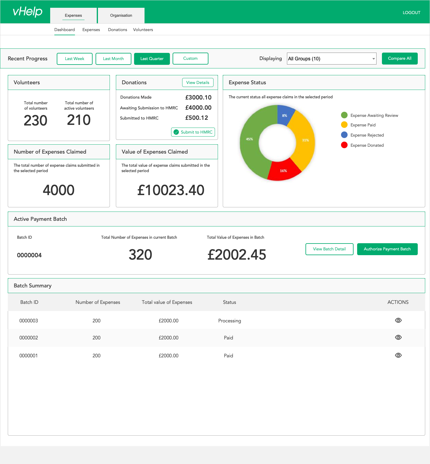
The focus for directors was on "at-a-glance" performance reporting for total organisation or at group level
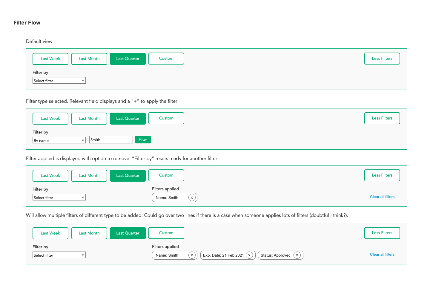
Filter sets were specced in detail to allow for a range of ad-hoc filtering
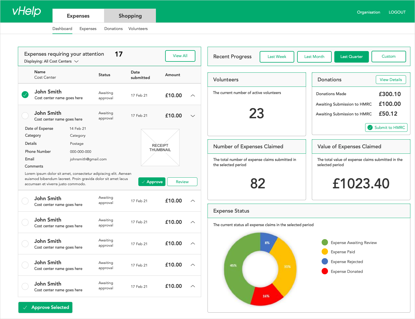
For volunteer managers the focus was on providing a task-list, with outstanding tasks being prioritised
Usability Testing
Usability testing was tackled in two ways:
- Detailed testing in a one to one environment using a clickable prototype. This was aimed at all stakeholders to ensure the interface was usable and would begin to counter their existing pain-points. This was also invaluable for collection of potential improvements for future sprints and spin-off features for collection and later implementation by the founders, such as the ability to pay any collection of people using the system, e.g. for user researchers who had participants to pay for a project.
- A more quantitative approach was applied for the volunteer audience only, testing if operations such as the upload of receipts would be usable for the wider audience. This gave an indicator of how much further research was required prior to launch to tackle friction.
Inspiration for future projects
I try to reflect on the positives and negatives of each project and build this into future engagements to ensure continuous improvement. Here are some areas I'll be looking to improve in the future.
01
The combination of testing approaches using qualitative and quantitative approaches for different problems is something I have often proposed but generally time and budget dictate only one solution is viable. This becomes a great example in action for future projects.
02
I took a longer route to journey mapping for this project as I wanted to ensure we understood the existing problems and spent the time iterating the happy path for each of the different stakeholders. I felt the project had less in the way of early change requests than similar projects when journey mapping was still performed, but with less in the way of iteration.